Wednesday, December 6, 2017
Sing Noel—Christmas 2017 Poster
This is GHCC's Christmas Musical, entitled Sing Noel. The musical has a woodsy, cabin lumberjack look so I tried to incorporate that feeling into the poster.
Project: Christmas Musical Promotion
Client: Celebration Singers
Details: 11"x17" Poster
Monday, November 13, 2017
5 Solas: Winter Camp 2018
GHCC's Winter Camp 2018 is tied into the church's Small Group Study for the Winter on the 5 Solas, but they wanted their own style and visual theme to distinguish it as a separate event. The direction became a Roman theme (so we could use the 5 as a Roman Numeral V) with Centurians vs. Gladiators as the main teams. It was very enjoyable researching this time period and culture. I have always had a fascination with Roman culture, so it was fun to explore it in an artistic way.
Project: GHCC Winter Camp 2018 Promo
Client: Golden Hills Community Church Student Ministries
Details: 5x16" Brochure, T-Shirts, and Crew-neck Sweatshirt
Wednesday, May 3, 2017
We Are Witnesses Book
In addition to the regular design of the branding for the current sermon series, this time I also designed a book for We Are Witnesses. It is an eleven-week study guide, and each week coincides with the message given the previous Sunday.
Project: Acts Series Study Guide
Client: Golden Hills Community Church
Details: 8.5x11", 74 page Book
Monday, May 1, 2017
We Are Witnesses
The current series at GHCC is "We Are Witnesses", a series in the Book of Acts. With a main emphasis on reaching the nations with the Gospel, I wanted the look of this to be a global background with icons to represent the basic message we are witnesses of: The death of Jesus, the resurrection of Jesus, and the coming of the Holy Spirit to all believers.
Project: Acts Series Branding
Client: Golden Hills Community Church
Sunday, April 16, 2017
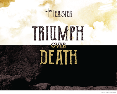
Easter 2017: Triumph Over Death
Coming off a string of colorful Easter promotions I finally tried out something I have always wanted to do for Easter, which is use a mostly Black & White palette. The Triumph Over Death theme seemed like a good time to try out a "light over darkness" theme in my artwork.
Project: Easter Promotion
Client: Golden Hills Community Church
Details: 3.67" x 8.5" Double-Sided Flyer
Wednesday, March 15, 2017
The Chocolate Plate
I know I'm in the minority, but I am not a fan of wine. So wine tasting does not sound like a good time for me. But chocolate tasting is something I can get behind. The Chocolate Plate is a new start-up that offers chocolate tasting for parties in Oregon. I designed the logo to look like the chocolate piping over some of the finer chocolates they serve. If you're in that area, or if you just want to look at pictures and drool, check out their website.
Project: Branding for Chocolate Tasting Company
Client: The Chocolate Plate
Tuesday, February 28, 2017
Vitals: GHCC Winter Camp 2017
This year's theme for Golden Hills Winter Camp was Vitals, with a tribal/Survivor style. I really wanted the colors to be warm for this theme, despite it being a winter camp. Exploring the things that are vital for life, warmth is one of them, and warm colors also seem to be incorporated into many tribal designs and clothing. The two teams for camp were Bios (representing physical needs) and Zoe (representing Spiritual needs). For Bios I made the logo a tiki statue to represent the physical in a tribal way, and for Zoe I made the symbol a flame to represent the spiritual in a tribal way. Had a lot of fun with this theme that visually is a lot different than what we've done for Winter Camps in the past.
Project: GHCC Winter Camp Promo
Client: Golden Hills Community Church Student Ministries
Details: 5x16" tri-fold brochure, T-Shirts, and Hooded Sweatshirt
Friday, February 24, 2017
The Abundant Life
It's been a long time! Still been busy working away, just haven't had much time to post. I'm going to try to do this more often and catch up a bit on the last few months of work. Currently at Golden Hills we are wrapping up our annual Small Group Campaign, which means workbooks! Here is what the cover looks like for this year. It's a study called The Abundant Life, exploring what it truly means to have life found in Christ.
I decided to give the study a vineyard theme for a few reasons. Vineyards are a great poster child for abundance. The culture around vineyards and wine-tasting is about the finer things in life; about embracing abundance. In this study we also spent a lot of time exploring Jesus' metaphor that He is the vine, we are the branches. He literally uses a vineyard example to make His point about how we only find true life when we are connected to Him. And lastly, vineyards are a big part of the area where I live. I see vineyards almost every day in the Bay Area, and they are a huge part of the culture here. Using the vineyard theme was a great way to communicate with and connect with the people of this area.
Client: Golden Hills Community Church
Details: 8.5"x11" Book
Sunday, January 15, 2017
Kabat & Associates Physical Therapy
This is the logo I designed for a local Physical Therapy clinic. It is owned by a husband and wife so they like to use the name K2 (two Kabats) when they refer to their company. Since K2 is also a mountain term, as well as climbing mountains having good connotations for physical therapy...you can see how it all came together fairly naturally.
Project: Physical Therapy logo
Client: Kabat & Associates Physical Therapy
Subscribe to:
Comments (Atom)


